Contemporary Arts Center
 Today we ventured to downtown Cincinnati to visit the Contemporary Arts Center. We've lived here 15+ years and had never been. Funny, but generally we don't take advantage of things in our own backyard. Part of the impetus for going was a photo contest at work in conjunction with the local Fine Arts Fund drive. The photos are supposed to show people enjoying the arts at one of the places supported by the fund. It's been going on for several weeks, and unfortunately participation in the contest is minimal. I thought I'd enter a few photos.
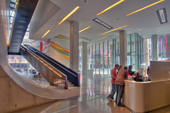
Aside from the lobby (the HDR image at right -- click to see a larger version in Flickr), there is only one area in the CAC where you can take photos (which is pretty annoying -- why can't you take non-flash photos?) and that is the UnMuseum gallery on the 6th floor. That gallery has several interactive exhibits.
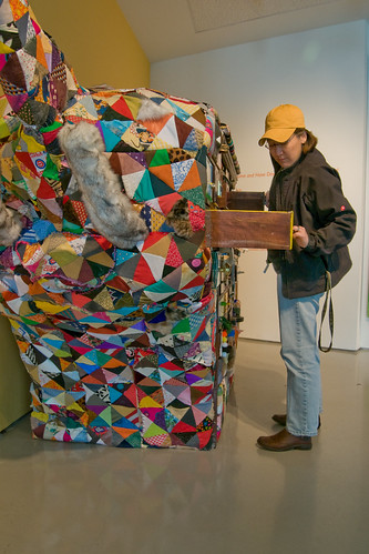
This is Dianne peeking in the drawers of "Sight Unseen: The Sensory Elephant" by Eric Brass and a host of other artists. Click on the link to read a detailed description of the work.
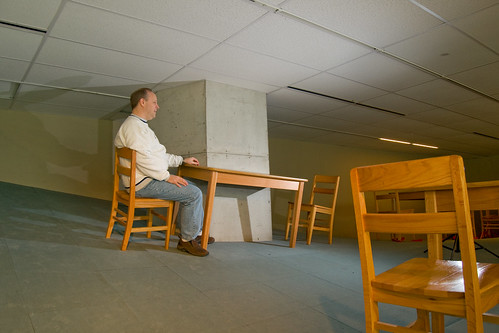
This is me in the work "Above and Below: The Hypar Room" by Allan Wexler. For a math geek, the floor in this work was really cool. The perspective in the photo looks odd, but that's because the floor was a steep curve in this part and the tables and chairs were tilted where I was sitting.
My favorite shot was Dianne at "Zeloso Paavo's Hands" by Anthony Luensman. She's a good sport to serve as a model. Sensors in the frame recognize your hand movements and cause orchestral music to play. The camera exposure was set for the sunlight coming through the skylight in the stairwell behind the glass. To get Dianne exposed properly, I used two flashes (one low and left and one held at shoulder level to the right. The light is balanced nicely and you can see the neon sign light at the top of the exhibit. The only thing I'd change is to raise the left flash much higher to get rid of the shadow behind the neon sign. So much to think about, but all the reading on the Strobist Blog is helping out.
Overall, we weren't too impressed with the museum. There wasn't a lot to see, and aside from a couple of the works in the Space Is The Place exhibit, I wasn't wowed. Nevertheless, got some OK shots.


3 comments:
Shoot, not only ave I not been there, I've never heard of it :-/
I like the room pic it looks neat!
Looks like an interesting place to visit...once.
Loved the space (very cool architecture), but the problem was that there was too much of it (empty, that is). Not much on display! Very disappointing.
Post a Comment